Live Demo ↗ | Documentation ↗ | Installation ↗
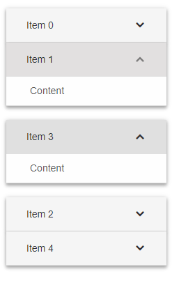
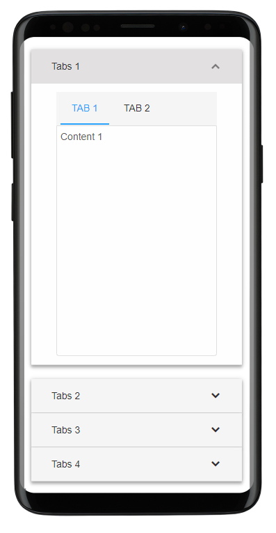
<smart-accordion> is a Custom HTML Element with expandable panels, part of the Smart HTML Elements. Each panel has header and content.
 <smart-accordion>
  <smart-accordion-item label="Item 1" content="Content 1" expanded></smart-accordion-item>
  <smart-accordion-item label="Item 2" content="Content 2"></smart-accordion-item>
  <smart-accordion-item label="Item 3" content="Content 3"></smart-accordion-item>
</smart-accordion>Smart HTML Elements components documentation includes getting started, customization and api documentation topics.
Getting Started Documentation | CSS Documentation | API Documentation
-
source/Javascript files.
-
source/styles/Component CSS Files.
-
demos/Demo files
-
Fork the
Smart-HTML-Elements-Corerepository and clone it locally. -
Make sure you have npm installed.
-
When in the
Smart-HTML-Elements-Coredirectory, runnpm installand thenbower installto install dependencies. -
Run a localhost or upload the demo on a web server. Then run:
- /demos/smart-accordion/smart-accordion-overview.htm
We are using ESLint for linting JavaScript code.
- Make sure your code is compliant with ESLint
- Submit a pull request with detailed title and description
- Wait for response from one of our team members
Apache License 2.0


