-
Notifications
You must be signed in to change notification settings - Fork 4
New issue
Have a question about this project? Sign up for a free GitHub account to open an issue and contact its maintainers and the community.
By clicking “Sign up for GitHub”, you agree to our terms of service and privacy statement. We’ll occasionally send you account related emails.
Already on GitHub? Sign in to your account
Research a design for 'Tracked contracts' screen #10
Comments
|
@jbargu I did a small mockup design for this that I believe would work great in term of UX. ideally it would be something similar to this : One left tab to select the chain you are in ( should visually display the chain on the tab bold & selected , and being the title on the right card ). Thinking that it could filter chain using a small search ( no need for BE it can be a simple filter ) A right card that contains all the tracked contracts inline editable with the + sign to add at the top & and some trash icons to either ( delete all if we want ) or delete per row Let me know what you think, I can dig more and do a better design if you want or if you guys think it's good we can start going this way. |
|
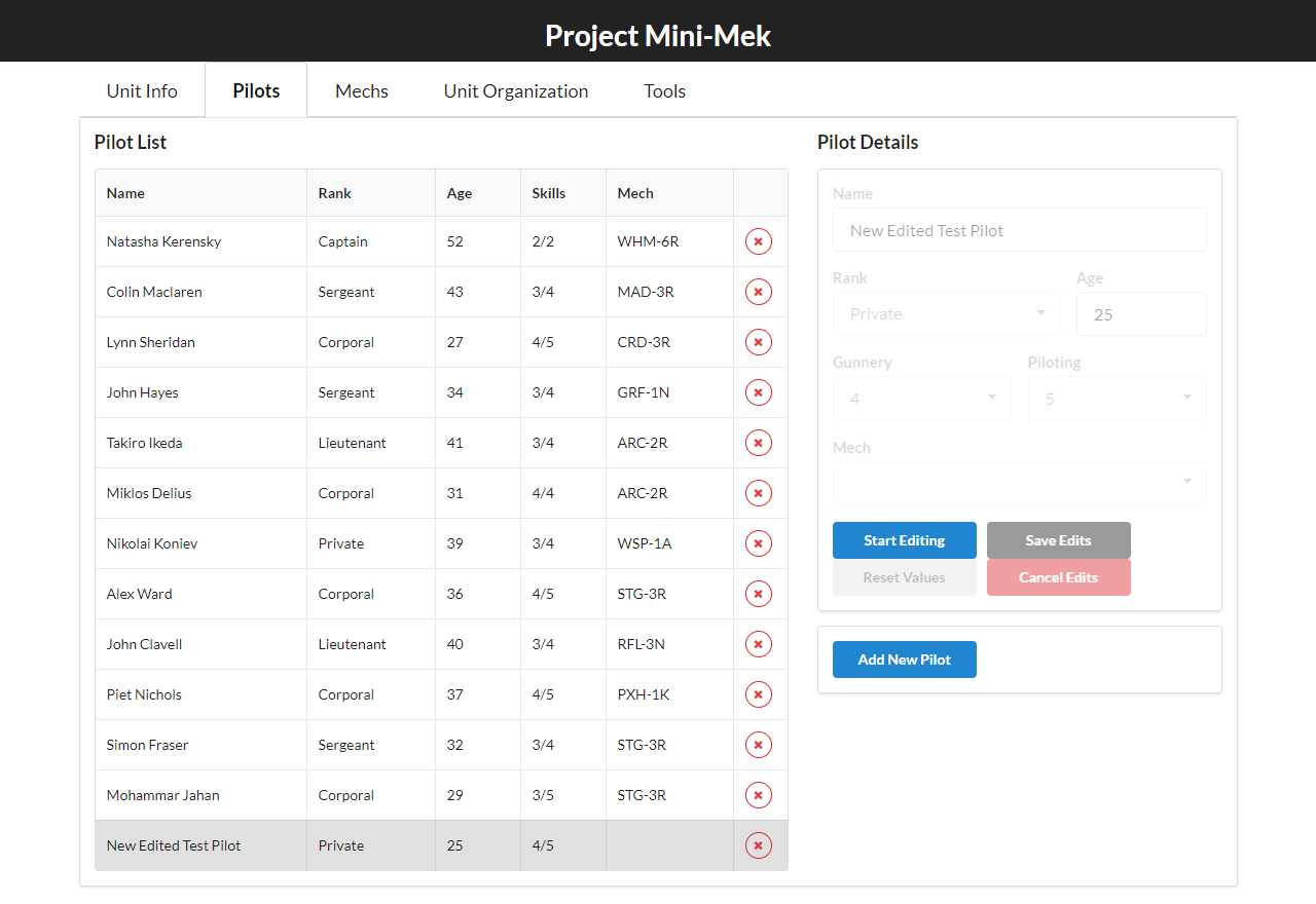
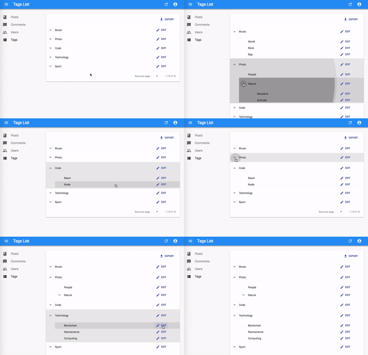
This is the animation of the right table : https://dribbble.com/shots/4763069-Edit |
|
@ZiyedB I think it looks good! I appreciate the simplistic design and if need be we can add additional stuff later. The only important thing is that the inline editable textbox should be able to provide error message for incorrect address. |
|
I'll probably go with the first as we suggested, when inputing we would just display the error within and not let the user finishing modify the input if invalid |


The node connects to different chains and listens for any on-chain events from the contracts listed in
tracked_contracts:The chain can be either EVM or Substrate based. Propose a design for a tab called 'Tracked contracts', which will list chains with the corresponding
tracked_contracts. The chains can be enabled/disabled. The contracts can be added/edited (validation of the addresses depending on the chain type) and deleted. User then clicks 'Save and apply', a response is returned by the backend, which should update the frontend as well as show a message box that the call was a success/an error.Some possible designs:
1) Flat hierarchy, e.g. tabs = chains, contracts are listed below, editing could also be done inline

2) Tree like structure with 2 levels

Personally I would prefer this to be more like 2), on a single screen.
The text was updated successfully, but these errors were encountered: