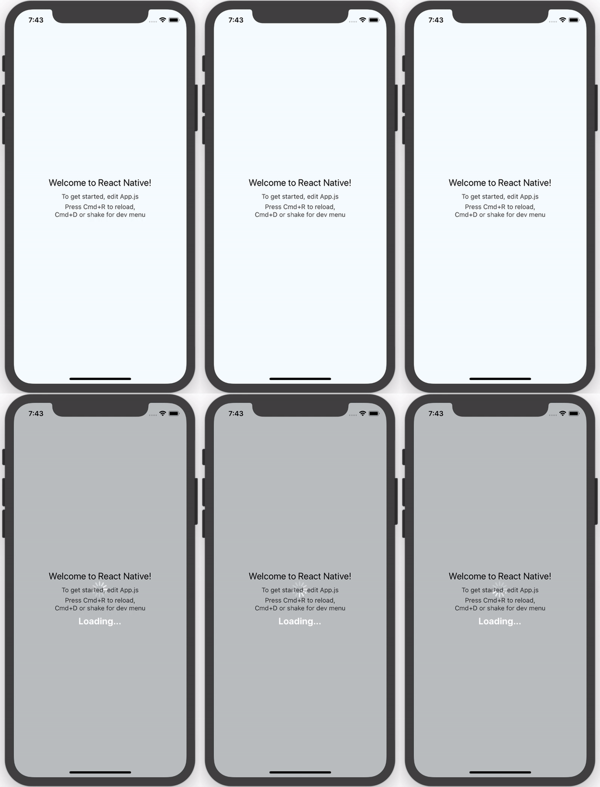
tldr; The only pure React Native Native iOS and Android loading spinner (progress bar indicator) overlay
For React Native version >=0.28.x use version >=0.3.x (0.2.x is broken, sorry!):
npm install --save react-native-loading-spinner-overlay@latestFor React Native version <=0.27.x use version 0.1.x:
npm install --save [email protected]This usage shows the default styles and properties.
- You can pass a String
sizeprop that can either be"large"or"small"(no other cross-platform sizes are supported right now, and by default it is"large") - You can pass a String
colorColorProp (e.g.redor#ff0000) to change the default spinner color (by default it is"white"for high contrast on the defaultoverlayColor; see below) - You can control visibility of the spinner using the Boolean prop
visible(Boolean, by default it isfalse) - To change the color of the overlay, pass a ColorProp as the
overlayColorprop (e.g.'rgba(0,0,0,0.25)') - Optional text field, activate by passing textContent Prop and style by passing textStyle Prop
- You can also pass a custom view to act as activity indicator.
import React, { View, Text } from 'react-native';

import Spinner from 'react-native-loading-spinner-overlay';

class MyComponent extends React.Component {

  constructor(props) {
    super();
    this.state = {
      visible: false
    };
  }

  /* eslint react/no-did-mount-set-state: 0 */
  componentDidMount() {
    setInterval(() => {
      this.setState({
        visible: !this.state.visible
      });
    }, 3000);
  }

  render() {
    return (
      <View style={{ flex: 1 }}>
        <Spinner visible={this.state.visible} textContent={"Loading..."} textStyle={{color: '#FFF'}} />
      </View>
    );
  }
}
To use a custom activity indicator just pass it as child of the component:
<Spinner visible={this.state.visible}>
  <Text>This is my custom spinner</Text>
</Spinner>For
>= 0.3.x:
- We use
ActivityIndicatornow!
For
0.2.x:
- Do not use this version due to #22, use
>= 0.3.xplease!
For
<= 0.1.x:
- iOS: this platform uses
Modal(docs/source) to overlay andActivityIndicatorIOS(docs) for the loading spinner - Android: this platform uses
Portal(source) to overlay andActivityIndicator(docs) for the loading spinner
For
>= 0.3.x:
- We use
ActivityIndicatornow!
For
0.2.x:
- This version is broken due to a dependency issue, see issue #22
For
<= 0.1.x:
- Docs don't exist yet for
Portal, see this issue on GitHub; once those are in, then we can add a link to the source in Platforms - Until a release of React Native is shipped for this pull request, Android's
ProgressBarAndroidwill not have support for aStyleAttrvalue of"Normal"- therefore we only support asizeprop of"small"or"large"right now (defaulting to"large") - in other words, we can only support Android's inverse styling with astyleAttrof"Inverse","SmallInverse"(for asizeprop of"small"), and"LargeInverse"(for asizeprop of"large") (since there is no"Normal"support right now for"size"of"normal").
- Fork/clone this repository
- Run
npm install - Make changes in
srcdirectory - Run
npm testwhen you're done - Submit a pull request
- Nick Baugh [email protected]


