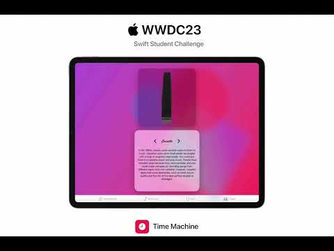
Hello, welcome to Igor Shefer's submission for WWDC23 Swift Student Challenge! Explore the 60s, 80s, and 2000s with Time Machine App through immersive 8D audio soundtracks, interactive 3D models of historical items, and an engaging storyline. Groove to iconic tunes, examine artifacts, and follow the lives of Martin Michaels and Paul Allen.
Here I will tell you about how I approached development, how I created media content of app to represent the epochs
While designing the app, I faced the challenge of making it age-appropriate while keeping the UI elements familiar to users to avoid confusion.
After studying various design works on Dribbble, I decided to implement Glassmorphism, a design pattern that allowed me to tweak the color style and fonts of the app without compromising the user experience. And the result? Simply stunning!
With Glassmorphism, not only does the color gradient on the background change as users move through time, but also the fonts. I carefully selected specific fonts for each year to match the corresponding era, adding an extra layer of authenticity to the app.
As someone who doesn't consider themselves a full-fledged designer, I am proud of how it turned out. Although I would have liked to work on the pricing of fonts, unfortunately, time constraints didn't allow for it. Nonetheless, I believe the overall design of the app is visually appealing and enhances the user's experience as they journey through different time epochs.
As I worked on the soundtrack for this App, my main goal was to capture the atmosphere of each era using 8D sound technology and music from those times.
When it came to selecting the music, I initially thought about using AI-generated music, but I found a limitation of 5 seconds per recording. So I had to search for free music and sounds on other services, which fortunately, I was able to do. However, finding the right music to represent the 80s proved to be a challenge. None of the songs I listened to seemed to capture the essence of that era.
Then, I remembered the enigmatic song "Blind the Wind", which was recorded in the 80s and had an unmistakable vibe of that time. The best part was that it had no known copyright owner. I downloaded the audio track from YouTube, removed the video, mixed it with the sound of a tape, and converted it to 8D. Voila! The perfect music for the 80s was ready.
When it came to representing the different eras in the Time Machine Playground App, I knew that objects from those years would be key in capturing the essence of each era. That's why I turned to SceneKit, ARKit, and 3D models frameworks.
I decided to showcase three items from each era, each representing a different sphere. The first item represents technology, the second represents music, and the third represents interior objects (except for 2008). Finding 3D models was surprisingly easy, thanks to the wonderful Sketchfab platform. It allowed me to easily find high-quality 3D models that were free and allowed for use.
While some models may have been heavy in terms of file size, it was worth it. The app now boasts stunning three-dimensional objects from different time epochs that users can closely examine and appreciate. These 3D models truly bring the essence of each era to life in the app


