-
-
Notifications
You must be signed in to change notification settings - Fork 354
UI Toolkit
Rock has a collection of fantastic UI controls that will help you develop blocks much quicker than if you had to write everything from scratch. This toolkit is quickly becoming one of the coolest features for Rock developers.
NOTE: Just quickly scan through this page to familiarize yourself with all UI controls that are available and refer back to it later.
This is a control for picking a financial account (fund) from hierarchy of Financial Account entities.
<Rock:AccountPicker ID="apFund" runat="server" Label="Fund" Required="True" />
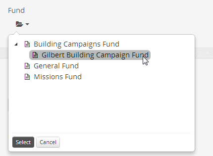
You can also require that a value be selected by setting Required="true".
You can programmatically set the value of the selected fund using the SetValue( int? id ) or SetValue( Fund fund ) method.
When fetching the selected value using the SelectedValue property, if nothing has been selected by the user the value will be Rock.Constants.None.IdValue.
    apFund.SetValue( 23 );
var fund = apFund.SelectedValue;Attributes are a key part of Rock Entities. This reusable control provides you with a standard mechanism for editing the attributes associated with your entity. It will generate a form necessary to add/edit an attribute. The AttributeEditor is pretty sophisticated and can handle all the possible FieldTypes supported by Rock.
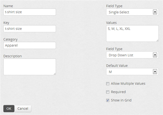
You'll probably want to wrap it in a panel and make it visible when appropriate.
    <asp:Panel ID="pnlGroupTypeAttribute" runat="server" Visible="false">
        <Rock:AttributeEditor ID="edtGroupTypeAttributes" runat="server"
            OnSaveClick="btnSaveGroupTypeAttribute_Click"
            OnCancelClick="btnCancelGroupTypeAttribute_Click" />
    </asp:Panel>
You'll need to implement handlers for OnSaveClick and OnCancelClick -- the later namely to hide the AttributeEditor and show whatever you were showing before the user started editing the attribute.
As shown in this example save handler code, you should pass an attribute to the AttributeEditor's GetAttributeProperties( Attribute ) method and verify that it's valid (IsValid) before you save anything.
    protected void btnSaveGroupTypeAttribute_Click( object sender, EventArgs e )
    {
        Rock.Model.Attribute attribute = new Rock.Model.Attribute();
        edtGroupTypeAttributes.GetAttributeProperties( attribute );

        // Controls will show warnings
        if ( !attribute.IsValid )
        {
            return;
        }

        // In this example we're only updating viewstate list (Rock.Web.UI.ViewStateList)
        // as a temporary measure and will actually save all the attributes later when
        // the user presses the save button to save the actual entity item.
        GroupTypeAttributesState.RemoveEntity( attribute.Guid );
        GroupTypeAttributesState.Add( attribute );

        pnlDetails.Visible = true;
        pnlGroupTypeAttribute.Visible = false;

        BindGroupTypeAttributesGrid();
    }
NOTE: Take a look at the GroupTypeDetail.ascx.cs block to see a fully working implementation.
This is a mostly standard Bootstrap badge. We say mostly standard because we added the ability to control the color of the badge via the BadgeType property (danger, warning, success, info) similar to the old Boostrap 2.3 labels and badges.

<Rock:Badge ID="badge" runat="server" BadgeType="Important" ToolTip="you have 6 unread messages" Text="6"></Rock:Badge>
Creates a Bootstrap Button which will disable itself upon click. (Useful for those cases when you really don't want the user to click more than once.) You can control the text that is displayed once the button has been clicked via the DataLoadingText property.

     <Rock:BootstrapButton ID="btnSave" runat="server" Text="Save" DataLoadingText="Saving..."
      CssClass="btn btn-primary" OnClick="btnSave_Click" />
You can also include font icons (such as the spinner) by including the correct markup in the DataLoadingText property:
DataLoadingText="<i class='icon-spinner icon-spin icon-large'></i> Saving"
ButtonDropDownList generates a nice, clean, Bootstrap Button Dropdown Menu.
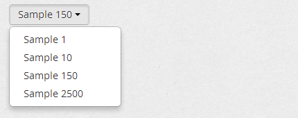
<Rock:ButtonDropDownList ID="ddlList" runat="server" />
You can manually bind the list's Items collection or data bind it as normal:
    ddlList.Items.Clear();
    ddlList.Items.Add( new ListItem( "Sample 1", "7" ) );
    ddlList.Items.Add( new ListItem( "Sample 10", "11" ) );
    ddlList.Items.Add( new ListItem( "Sample 150", "13" ) );
    ddlList.Items.Add( new ListItem( "Sample 2500", "17" ) );
    ddlList.SelectedValue = "13";

    // or via normal data-binding...
    ddlList.DataSource = new Rock.Model.CategoryService().Queryable()
        .OrderBy( a => a.Name ).ToList();
    ddlList.DataValueField = "Id";
    ddlList.DataTextField = "Name";
    ddlList.DataBind();
You can set the selected item by value using the SelectedValue property and you can get the selected item's value using the SelectedItem.Value property:
    // Set selected item by value
    ddlList.SelectedValue = "13";

    // Get selected value
    var selectedValue = ddlList.SelectedItem.Value;
You can also enable auto-postback of selection change by setting a handler for the OnSelectionChanged property.
    <Rock:ButtonDropDownList ID="ddlWithPostBack" runat="server"
        OnSelectionChanged="ddlWithPostBack_SelectionChanged"/>
    protected void ddlWithPostBack_SelectionChanged( object sender, EventArgs e )
    {
        var text = ddlWithPostBack.SelectedItem.Text;
        var value = ddlWithPostBack.SelectedItem.Value;
}The CampusPicker generates a checkbox list to enable selection of zero or more campuses.
<Rock:CampusPicker ID="cpCampuses" runat="server" />

You can bind it by setting its Campuses property like this:
cpCampuses.Campuses = campusService.Queryable().OrderBy( a => a.Name ).ToList();To set the selected items, use the SelectedCampusIds property setting it to a list of integers. Here's an example taken from the MarketingCampaignDetail block:
    cpCampuses.SelectedCampusIds = marketingCampaign.MarketingCampaignCampuses
.Select( a => a.CampusId ).ToList();Creates a reCAPTCHA which will verify that the user is a person and not a robot. (Useful for forms or other blocks where you intend a user to submit text.) The control can be marked as non-required to indicate that the user may fill it out to verify they are a real person but would not be required to do so. This in particular would be advantageous in cases where you want to auto-approve a post from a verified real person.

<Rock:Captcha ID="cpCaptcha" runat="server" Required="true" Label="Verification" />
When processing any event where you want to be sure it was a real person that submitted the form you should call the following method to ensure that the captcha was actually valid:
bool isValid = cpCaptcha.IsResponseValid();Before displaying the captcha control, you should call it's .IsAvailable property to determine if the captcha system is available on this Rock install. The admin must configure the captcha system first before it can be used. If the captcha is optional then you can just do something simple like:
cpCaptcha.Visible = cpCaptcha.IsAvailable;Otherwise if it is required for proper operation of your block then you should display an error message to the user informing them that they must configure the captcha system to use your block.
This gives your users the ability to select a category from a tree style view of categories.
<Rock:CategoryPicker ID="cpCategory" runat="server" Label="Parent Category" />
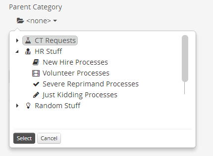
When using the category picker with an entity that has a category, specify the entity type using the CategoryEntityTypeName property. That will cause the category picker to only list the right kind of categories.
You can also require a value be selected by setting Required="true".
    <Rock:CategoryPicker ID="cpCategory" runat="server" Label="Category"
        Required="true" CategoryEntityTypeName="Rock.Model.PrayerRequest"/>
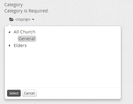
When fetching the selected value using the SelectedValue property, if nothing has been selected by the user the value will be Rock.Constants.None.IdValue.
Use this control when you want to ensure that the person intentionally wants to leave the page without saving any changes they have made.
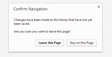
<Rock:ConfirmPageUnload ID="confirmExit" runat="server" ConfirmationMessage="Changes have been made to this family that have not yet been saved." Enabled="false" />
NOTE: You should enable the control (confirmExit.Enabled = true) whenever or wherever you know something has changed on the form.
Then, you'll need to clear the confirmation on the client side of your "save" button similar to this:
    <asp:LinkButton ID="btnSave" runat="server" Text="Save" CssClass="btn btn-primary" OnClick="btnSave_Click" OnClientClick="javascript:disableConfirmation();" />

    <script>
    // Need to set the value of the confirmation's rendered hidden field prior to postback,
    // since the save is doing a Redirect and even though confirmation is disabled by the save,
    // that information is not rendered when returning with a redirect.
    // If validation fails during the save, the confirmation will be re-enabled (and rendered
    // correctly without the redirect)
    function disableConfirmation() {
        $('#<%=confirmExit.ClientID%>').val('');
    }
    </script>
DataDropDownList generates a simple dropdown list.

    <Rock:DataDropDownList ID="ddlFrequencyType" runat="server"
      SourceTypeName="Rock.Model.FinancialPledge, Rock"
      PropertyName="PledgeFrequencyValueId"/>
Your can bind to the DataDropDownList using the BindToDefinedType() method shown in this example:
    var frequencyTypeGuid =
        new Guid( Rock.SystemGuid.DefinedType.FINANCIAL_PLEDGE_FREQUENCY );
    ddlFrequencyType.BindToDefinedType( DefinedTypeCache.Read( frequencyTypeGuid ) );
If you add an "optiongroup" attribute to your ListItems the DropDownList will render an optiongroup grouping for you:

Use the SetValue method when setting the selected value as this special extension method properly handles the case where the selected item is not in the list's current set of items.
ddlMyList.SetValue( someIdOrGuid );This control renders a label, text box, and data-validation control.
  <Rock:DataTextBox ID="tbSourceSQL" runat="server" LabelText="Source SQL"
      SourceTypeName="Rock.Model.Metric, Rock" TextMode="MultiLine" Rows="3"
      PropertyName="SourceSQL" />
And because it inherits from the Rock:RockTextBox you can also use the PrependText and AppendText properties to include text at the start and end of the field.
This is a standard element for picking a valid date or date time.
    <Rock:DateTimePicker ID="dpStartDate" runat="server" Label="Start Date"
        DatePickerType="Date" Required="true" />
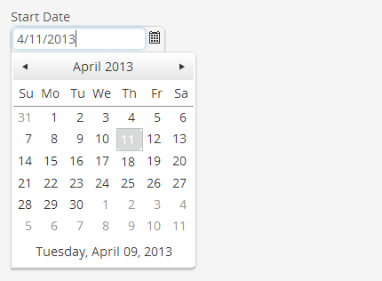
Set the DatePickerType property to "Date" for selecting only the date portion of a DateTime.
NOTE: At a later date we're expecting to also support an option for also selecting time.
You can also require that a value be selected by setting Required="true".
You can set or get the value of the selected date using the SelectedDateTime property.
When fetching the selected date using the SelectedDateTime property, if nothing has been selected the value will be null.
dpStartDate.SelectedDateTime = DateTime.Now.AddDays( 2 );This control (primarily intended for use with non-image files) is wrapper of the excellent, easy to use Kendo UI Upload widget but we've made it even easier for developers too.

As soon as the user selects the file, it's automatically uploaded and stored in Rock.

    <Rock:FileUploader ID="fsFile" runat="server" Label="Upload New File"
        OnFileUploaded="fsFile_FileUploaded"
 />
Using the BinaryFileService(), you can get a reference to the file that was saved as illustrated in this example OnFileUploaded handler:
    protected void fsFile_FileUploaded( object sender, EventArgs e )
    {
        var binaryFileService = new BinaryFileService();
        var binaryFile = binaryFileService.Get(fsFile.BinaryFileId);
        if ( binaryFile != null )
        {
            // do something with the file
        }
    }
NOTE: Remember, if you are going to use the BinaryFileService() class and another data *Service class, you will need to wrap your code in a
using (new Rock.Data.UnitOfWorkScope() ){ // your code }block.
If you're expecting images to be uploaded, check out the Rock:ImageUploader described below.
The Rock Grid makes it a breeze to quickly display your entity lists.
        <Rock:Grid ID="gSites" runat="server" AllowSorting="true" OnRowSelected="gSites_Edit">
            <Columns>
                <asp:BoundField DataField="Name" HeaderText="Name" SortExpression="Name" />
                <asp:BoundField HeaderText="Description" DataField="Description"
                    SortExpression="Description" />
                <asp:TemplateField HeaderText="Domain(s)">
                    <ItemTemplate><%# GetDomains( (int)Eval("Id") ) %></ItemTemplate>
                </asp:TemplateField>
                <asp:BoundField HeaderText="Theme" DataField="Theme" SortExpression="Theme" />
                <asp:BoundField HeaderText="Default Page" DataField="DefaultPageRoute"
                    SortExpression="DefaultPageRoute" />
                <Rock:BoolField DataField="IsSystem" HeaderText="System" SortExpression="IsSystem" />
                <Rock:SecurityField TitleField="Name" />
                <Rock:DeleteField OnClick="gSites_Delete" />
            </Columns>
        </Rock:Grid>
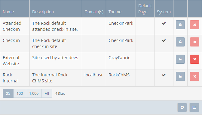
Prior to Rock McKinley v4 (1.4.0), you could only use an IList and not a IQueryable for your DataSource. However as of v4, we've created a new SetLinqDataSource( queryable ) option. This was done to improve performance for grids that are binding to large lists.
A v3 IList example from the PageList block:
    var qry = pageService.Queryable("Layout")
        .Where( t =>  t.Layout.SiteId == siteId || sitePages.Contains( t.Id ) );
    gPages.DataSource = qry.ToList();
    gPages.DataBind();
A v4 IQueryable example taken from WorkflowList block:
    var qry = workflows.Select( w => new
    {
        w.Id,
        w.Name,
        Initiator = w.InitiatorPersonAlias.Person,
        Activities = w.Activities.Where( a => a.ActivatedDateTime.HasValue && !a.CompletedDateTime.HasValue
            ).OrderBy( a => a.ActivityType.Order ).Select( a => a.ActivityType.Name ),
        w.CreatedDateTime,
        Status = w.Status,
        IsCompleted = w.CompletedDateTime.HasValue
    } );

    gWorkflows.SetLinqDataSource( qry );
    gWorkflows.DataBind();
When using an IQueryable you need to make sure you've sorted first because the grid will only fetch the correct amount of records if paging is enabled (AllowPaging).
Also note how an new anonymous object was created for the result select. This is done to further improve performance since only certain properties are needed in the view.
If you have a description for each row item but you don't want to add it as a column (perhaps because it's too long and would overrun the row), you can use the DescriptionField property of the grid.
Consider this example from the GroupTypeList block. The DescriptionField property will bind to the data-source's Description property for each GroupType.
        <Rock:Grid ID="gGroupType" runat="server" DescriptionField="Description">
            <Columns>
                ...
            </Columns>
        </Rock:Grid>
When the user hovers over a row, the description is displayed:

Set the Grid's Actions.ShowAdd to true to enable the Add icon on the grid toolbar. Add your custom handler to the grid's Actions.AddClick handler as shown in the example below.
This generates a native XLSX file. If the grid's Caption property is set it will be used for the filename. There is a property on the grid ShowActionExcelExport that allows the developer to disable the display of the icon.
Set the Grid's Actions.ShowExcelExport to false to prevent the default Export to Excel functionality.
Tap into the grid's drag-and-drop reordering capabilities by binding your custom reorder handler to the grid's GridReorder event handler. Since the Rock.Data.Service has a Reorder() method, any entity service class that inherits from Service<t> can easily have its items reordered.
protected override void OnInit( EventArgs e )
{
    // ...
    gMyGrid.GridReorder += gMyGrid_GridReorder;
    gMyGrid.Actions.ShowAdd = true;
    gMyGrid.Actions.AddClick += gMyGrid_Add;
}

void gMyGrid_GridReorder( object sender, GridReorderEventArgs e )
{
    // ...
    Service.Reorder( mylist, e.OldIndex, e.NewIndex, CurrentPersonId );
    BindGrids();
}

void gMyGrid_Add( object sender, EventArgs e )
{
    ShowEdit( 0 ); // a method that builds a form for your entity/item
}You also need to implement a GridRebind handler for data rebinding:
    protected override void OnInit( EventArgs e )
    {
       gMyGrid.GridRebind += gMyGrid_GridRebind;
//...If using a DeleteField in a grid but you want to suppress the delete confirmation dialog popup from appearing, set the ShowConfirmDeleteDialog property to false.
If your grid needs to have an alert notification-box functionality, just add a Rock:NotificationBox with a CSS class of "alert-grid". This will properly style your alert box once its made visible in your code.
    <Rock:NotificationBox ID="nbClosedWarning" CssClass="alert-grid" runat="server"
        NotificationBoxType="Info" Title="Note"
        Text="This batch has been closed and transactions cannot be edited." Visible="false"
        Dismissable="false" />

    <Rock:Grid ID="gMarketingCampaignAudiencesPrimary" runat="server" ... >
        <Columns>
            ...
        </Columns>
    </Rock:Grid>
-
When adding columns to grids you should now use Rock:RockBoundField instead of asp:BoundField and Rock:RockTemplateField instead of asp:TemplateField.
-
There is a property on all Rock grid column fields called ColumnPriority. This controls when the column will show based on the width of the browser. If you do not provide a value, the column will always show. Also, if you forget and use one of the asp: column field types it will also default to always show.
-
The available column priority values are "Always"(default), "TabletSmall", "Tablet", "DesktopSmall", "Desktop", "DesktopLarge". Think of it like this: using the value TabletSmall will cause your column to appear once the width becomes the size of a small tablet (or larger).
TIP: It's easy to over think all the cases of when-what-should-show. We say keep it simple. Unless you really have something that requires great specificity, only set a few columns with one of the "Desktop" values. That will mean they won't be seen unless the user is on a desktop.
In addition to the three classes (grid-table, table-bordered, and table-striped; see Bootstrap Base CSS Tables) used to style the Grid, there are two other classes (table-full and table-light) which are used based on the grid's (DisplayType). Setting the DisplayType property of the grid to "Light" will create a simplified grid without a heavy header or footer.
    <Rock:Grid ID="gMarketingCampaignAudiencesPrimary" runat="server" DisplayType="Light">
        <Columns>
            <asp:BoundField DataField="Name" HeaderText="Primary Audience" />
            <Rock:DeleteField OnClick="gMarketingCampaignAudiences_Delete" />
        </Columns>
    </Rock:Grid>
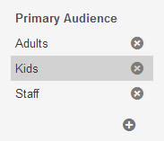
The Rock Grid uses bootbox which uses Twitter Bootstrap Modals for things like delete confirmation, etc. Therefore theme makers will be able to style the modals to suite their needs.
The GridFilter provides a standard mechanism for filtering your grid and for retaining the values a user sets in the filter. By default your grid should 'show everything' and then use filters to reduce the amount of data on the grid. You should also store the user's filter settings for re-use later.

An excerpt from the Financial.ascx block.
<Rock:GridFilter ID="rFilter" runat="server"
OnApplyFilterClick="rFilter_ApplyFilterClick" OnDisplayFilterValue="rFilter_DisplayFilterValue">
  <Rock:DateTimePicker ID="dtStartDate" runat="server" SourceTypeName="Rock.Model.FinancialTransaction, Rock"
    PropertyName="TransactionDateTime" Label="From Date" />
	<Rock:DateTimePicker ID="dtEndDate" runat="server"  SourceTypeName="Rock.Model.FinancialTransaction, Rock"
    PropertyName="TransactionDateTime" Label="To Date" />
	<Rock:RockTextBox ID="txtFromAmount" runat="server" Label="From Amount"></Rock:RockTextBox>
	<Rock:RockTextBox ID="txtToAmount" runat="server" Label="To Amount"></Rock:RockTextBox>
	<Rock:RockTextBox ID="txtTransactionCode" runat="server" Label="Transaction Code"></Rock:RockTextBox>
	<Rock:RockDropDownList ID="ddlFundType" runat="server" Label="Fund Type" />
	<Rock:RockDropDownList ID="ddlCurrencyType" runat="server" Label="Currency Type" />
	<Rock:RockDropDownList ID="ddlCreditCardType" runat="server" Label="Credit Card Type" />
	<Rock:RockDropDownList ID="ddlSrcType" runat="server" Label="Source Type" />
	</Rock:GridFilter>
The OnApplyFilterClick handler will fire once the user clicks the Apply button in the filter. In your handler you may want to save certain settings as user's preferences and re-bind your grid using the filters.
By calling the filter's SaveUserPreference(string key, string value) method with the value of each field, Rock will store the user's preferences for re-use next time they use the filter/grid on this page.
  protected void rFilter_ApplyFilterClick( object sender, EventArgs e )
  {
      rFilter.SaveUserPreference( "From Date", dtStartDate.Text );
      rFilter.SaveUserPreference( "To Date", dtEndDate.Text );
      rFilter.SaveUserPreference( "From Amount", txtFromAmount.Text );
      rFilter.SaveUserPreference( "To Amount", txtToAmount.Text );
      // ...
      rFilter.SaveUserPreference( "Source", ddlSrcType.SelectedValue != All.Id.ToString() ?
        ddlSrcType.SelectedValue : string.Empty );

      BindGrid();
}
The next time the user views the grid on that page, the filter grid will display the user's previously stored preferences.

Normally the filter will automatically display previously stored filter preferences, however in certain cases the value that is stored is a primary key (i.e., not suitable for displaying). In this case you should can handle the GridFilter's DisplayFilterValue event.
For example, suppose we've got a dropdown list of SourceTypes in our filter which are actually items of a particular Defined Type. To display the name of the selected item in the dropdown list we must convert the stored key value to the proper name as shown in this code snippet from the Financial.ascx.cs block. The event argument's Key will be the string you provided when you called SaveUserPreference.
protected void rFilter_DisplayFilterValue( object sender, Rock.Web.UI.Controls.GridFilter.DisplayFilterValueArgs e )
{
    switch ( e.Key )
    {
        // Handle each user preference as needed
        // ...

        case "Source":
            int definedValueId = 0;
            if ( int.TryParse( e.Value, out definedValueId ) )
            {
                var definedValue = DefinedValueCache.Read( definedValueId );
                if ( definedValue != null )
                {
                    e.Value = definedValue.Name;
                }
            }
            break;
    }
}
Notice how the e.Value is parsed and used to fetch the corresponding DefinedValue from the cache. If it was found, the e.Value is set to its Name property. This will be a common approach when using Defined Types in any grid filters you create.
When the user has a chance to filter based on a yes/no (boolean) property, it's recommended that you allow them to use a radio-button-list to make their choice with a three option list:
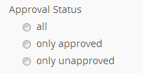
With this approach the user can easily choose to see "all" (yes or no), or only the "yes" or only the "no" items. In this case, you may also choose to use a drop-down-list. Normally a drop-down-list hides what other choices a user may make but in this case they are fairly intuitive and expected.
There are a growing number of custom data-bound fields you can use inside a Rock Grid for more rapid and consistent development. You simply use them inside a Rock:Grid as you would standard data bound grid controls and bind them to the data item's property using the DataField.
    <Rock:Grid ID="gGrid" runat="server">
        <Columns>
            <%-- ... Examples ... --%>
            <Rock:BoolField DataField="IsSystem" HeaderText="System"
               SortExpression="IsSystem" />
            <Rock:SecurityField />
        </Columns>
    </Rock:Grid>
The BadgeField will style your field's value into a standard Bootstrap badge.
    <Rock:BadgeField DataField="Blocks.Count" HeaderText="Flag Count"
        SortExpression="Blocks.Count" ImportantMin="0" ImportantMax="0"
        InfoMin="1" InfoMax="1" SuccessMin="2"  />

You can control the badge color (BadgeType) based on the field's value by setting an appropriate *Min and/or *Max value (int) for the Success, Warning, Important (deprecated), and Danger (Rock v4.1) and Info properties as shown above. If you need more control you can also implement a handler for OnSetBadgeType to do something like this:
❗ v4️⃣ "Important" is being deprecated and "Danger" has been implemented in keeping with Bootstrap standard naming.
    protected void Blocks_SetBadgeType( object sender, BadgeRowEventArgs e )
    {
        int blockCount = (int)e.FieldValue;
        if ( blockCount == 0 )
        {
            e.BadgeType = BadgeType.Important;
        }
        else if ( blockCount > 1 )
        {
            e.BadgeType = BadgeType.Success;
        }
        else
        {
            e.BadgeType = BadgeType.Info;
        }
}The BoolField displays a check-mark (a Bootstrap "ok" icon glyph) when your Boolean value is true and displays nothing if it is false.
<Rock:BoolField DataField="IsSystem" HeaderText="System" SortExpression="IsSystem" />

This field will render your DateTime properties using Rock standard date formatting and will not include the time part of the item's value.
<Rock:DateField DataField="EndDate" HeaderText="End Date" SortExpression="EndDate"/>

This field will render your DateTime properties using Rock standard date formatting and will not include the time part of the item's value.
    <Rock:DateTimeField DataField="LastRunDateTime" HeaderText="Last Run Date"
      SortExpression="LastRunDateTime" />

This field adds a standard "delete" button for each item in the grid. You need to write the OnClick handler to actually perform the delete.
<Rock:DeleteField OnClick="gCampuses_Delete" />

This field adds a standard "edit" button for each item in the grid.
<Rock:EditField OnClick="gGridExample_Edit" />

You need to write the OnClick handler for the edit action.
    protected void gGridExample_Edit( object sender, RowEventArgs e )
    {
        // this will be whatever you used for your Grid's DataKeyName
        Guid aGuid = (Guid)e.RowKeyValue;
        ShowEdit( aGuid );
}Similar to the Rock:EditField, this is actually intended for use with editing an item's column value. You can see this used in combination with the Rock:ModalDialog in the Attributes.ascx block.
<Rock:EditValueField OnClick="rGrid_EditValue" />

You need to write the OnClick handler for the edit action.
    protected void rGrid_EditValue( object sender, RowEventArgs e )
    {
        ShowEditValue( (int)rGrid.DataKeys[e.RowIndex]["id"], true );
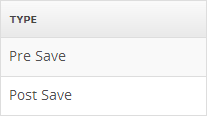
}This field can bind to an entity property that is an enum. For example, consider the Workflow entity's WorkflowTriggerType property; it is an enum such as shown here:
    public enum WorkflowTriggerType
    {
        PreSave = 0,
        PostSave = 1,
        PreDelete = 2,
        PostDelete = 3
    }
When binding in a grid using the Rock:EnumField like this:
<Rock:EnumField DataField="WorkflowTriggerType" HeaderText="Type" />
It will display the item's enum name value using a 'split on camelCase' and/or 'split on TitleCase' algorithm.
This is a draggable reorder widget that let's the user reorder an entity item's order.
<Rock:ReorderField />

You will need to implement a GridReorder handler to deal with the reorder action when it occurs. Your method can access the OldIndex and NewIndex values from the GridReorderEventArgs. Consider this simplified example from the Pages.ascx.cs block:
    protected override void OnInit( EventArgs e )
    {
        base.OnInit( e );
        rGrid.GridReorder += rGrid_GridReorder;
    }

    void rGrid_GridReorder( object sender, GridReorderEventArgs e )
    {
        var pageService = new Rock.Model.PageService();
        var parentPageId = PageCache.Read(RockPage.PageId).ParentPageId;

        // get the list of pages
        var pagesList = pageService.GetByParentPageId( parentPageId ).ToList();
        pageService.Reorder( pagesList, e.OldIndex, e.NewIndex, CurrentPersonId );

        BindGrid();
}If your item supports security, adding this column will display a security icon button which will allow the user to set the item's security via a modal popup.
<Rock:SecurityField />

Clicking on the security icon will create a modal popup for editing the items security.
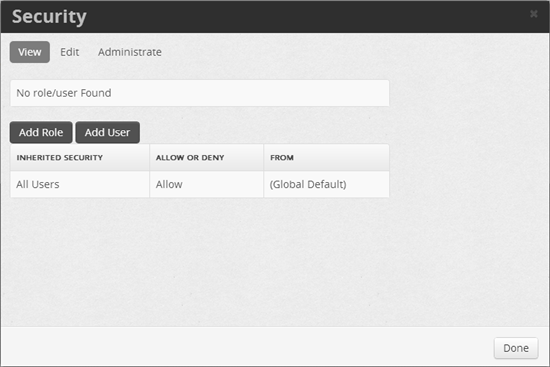
To properly use this field, you need to set the EntityType to the appropriate Rock Entity in your Block's OnInit method as seen in this example from the SiteList.ascx.cs block:
    protected override void OnInit( EventArgs e )
    {
        base.OnInit( e );

        // ...
        SecurityField securityField = gSites.Columns[3] as SecurityField;
        securityField.EntityType = typeof( Rock.Model.Site );
}Based on Mattia Larentis' Bootstrap Switch project, the ToggleField will generate a modern toggle-style switch that's useful for letting the user change a boolean property inline. You bind it to your items' property by setting the DataField value and you can control the on and off text with the OnText and OffText respectively.
    <Rock:ToggleField DataField="IsApproved" HeaderText="Approval Status"
      CssClass="switch-large" Enabled="True" OnText="yes" OffText="no"
      OnCheckedChanged="gPrayerRequests_CheckChanged" />

You will also need to define an OnCheckedChanged handler to make the corresponding changes when the user clicks the toggle button. See the gPrayerRequests_CheckChanged handler in the PrayerRequestList.ascx.cs block for an example implementation.
By default the field will use the switch-mini CSS style, but you can override it by setting the CssClass property.
NOTE: If you need to disable the toggle field based on a users permissions, since their is currently no way to attach your Block's custom security actions (example
[AdditionalActions( new string[] { "Approve" } )]) into the grid, you will need to disable each toggle field during the grid'sOnRowDataBoundevent. See thegPrayerRequests_RowDataBoundmethod in thePrayerRequestList.ascx.csblock for an example implementation.
This control gives you a simple mechanism for picking a group from the list of groups in Rock.
   <Rock:GroupPicker ID="gpGroup" runat="server" Required="false" Label="Parent Group"
     OnSelectItem="gpGroup_SelectedIndexChanged"/>
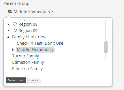
You can set the selected item by value using the SetValue( Group ) method and you can get the selected item's id (string) using the SelectedValue property or as an in with the SelectedValueAsInt() method:
    // Set selected item by value
    gpGroup.SetValue( group.ParentGroup );

    // Get selected value (the group id) or get the id value as an int
    string groupIdstring = gpGroup.SelectedValue;
    int groupId = gpGroup.SelectedValueAsInt();
You can also enable auto-postback of selection change by setting a handler for the OnSelectItem property.
    protected void gpGroup_SelectedIndexChanged( object sender, EventArgs e )
    {
        // Grab the selected item's id and do what ever you need to do
        int? groupId = gpGroup.SelectedValueAsInt();

// ...This creates a Bootstrap Label but we've added a few additional custom LabelType options to control the color.

  <Rock:HighlightLabel ID="hlDefault" runat="server" LabelType="Default" Text="Default" />
  <Rock:HighlightLabel ID="hlPrimary" runat="server" LabelType="Primary" Text="Primary" />
  <Rock:HighlightLabel ID="hlSuccess" runat="server" LabelType="Success" Text="Success" />
  <Rock:HighlightLabel ID="hlInfo" runat="server" LabelType="Info" Text="Info" />
  <Rock:HighlightLabel ID="hlWarning" runat="server" LabelType="Warning" Text="Warning" />
  <Rock:HighlightLabel ID="hlDanger" runat="server" LabelType="Danger" Text="Danger" />
  <Rock:HighlightLabel ID="hlCampus" runat="server" LabelType="Campus" Text="Campus" />
  <Rock:HighlightLabel ID="hlType" runat="server" LabelType="Type" Text="Type" />
  <Rock:HighlightLabel ID="hlCustom" runat="server" LabelType="Custom" CustomClass="danger" Text="Custom" />
While you can set the Text property to include HTML (such as font icons), you can also do this a little easier just by setting the IconCssClass property to the Font Awesome icon css class name you want to be displayed in the label.
<Rock:HighlightLabel ID="hlErrors" runat="server" LabelType="Danger" IconCssClass="fa-flag" Text="errors" />
This is a widget for selecting (simple one step uploading) and/or displaying an existing image from Rock. It uses the Kendo Upload technology.
<Rock:ImageUploader ID="imgIconSmall" runat="server" Label="Small Icon Image" />

When the user chooses an image from their computer, it will immediately upload the image and store it in the Rock BinaryFile table. The ImageUploader's ImageId property will hold the Id of the BinaryFile entity in Rock. To attach/relate the image to your entity, just set the ImageId to the appropriate property of your entity as seen in this example:
    category.IconSmallFileId = imgIconSmall.ImageId;

    // then save as usual...
    categoryService.Save( category, CurrentPersonId );
Once an image has been set, it will also display a thumbnail (50x50) of the image as seen in this example:

To display an image manually, perhaps in your ShowEditDetails() methods, simply set the ImageUploader's ImageId property to a valid file Id:
    imgIconSmall.ImageId = category.IconSmallFileId;
    imgIconLarge.ImageId = category.IconLargeFileId;
If you just want to display an image in a more read only fashion, perhaps in your ShowDetails() method, you can use the following approach using the GetImage.ashx feature in Rock:
<asp:Literal ID="litImgHtml" runat="server" />
    litImgHtml.Text = string.Format( "<img src='{0}GetImage.ashx?id={1}&width=50&height=50'/>",
this.ResolveRockUrl( "~" ), entity.IconSmallFileId );The ModalAlert will handle building a nice, standard Rock modal alert window that slides down when invoked with the Show() method. You will probably want put this in your asp:UpdatePanel for the best effect.
<Rock:ModalAlert ID="maWarning" runat="server" />
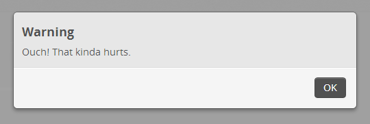
When needed, you show the modal window using Show( string, ModalAlertType ). You can use any of the Rock.Web.UI.Controls.ModalAlertType enum values including Alert, Information, Warning. The modal window header/title will be appropriate to the ModalAlertType you specify.
    string errorMessage = "Ouch!  That kinda hurts.";
    maWarning.Show( errorMessage, ModalAlertType.Warning );
    return;
Remember: Use that same friendly, cool (but not cheeky) 'voice' in your the text for your alerts, notifications and modals.
This modal is useful when you really need to get the user's attention and have them supply some data or answer a question before continuing. You'll typically include some stuff inside the <Content>...</Content> of the Rock:ModalDialog. A Save and Cancel button will be provided on the modal, but you'll need to set up a handler for the OnSaveClick property.
    <Rock:ModalDialog ID="mdDialog" runat="server" Title="One More Thing..."
        OnSaveClick="mdDialog_SaveClick">
        <Content>
            <asp:ValidationSummary ID="valSummaryValue" runat="server"
              CssClass="alert alert-error" />
            <fieldset>
                <legend>Can I get your name?</legend>
                <Rock:LabeledTextBox ID="tbMdName" runat="server" Label="Full Name"
                    Placeholder="John Smith" />
            </fieldset>
        </Content>
    </Rock:ModalDialog>
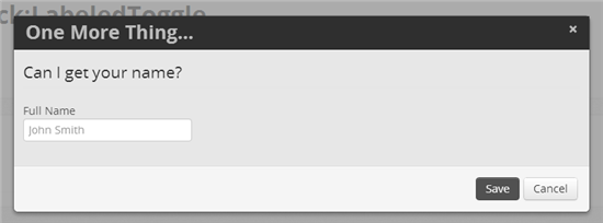
Use the Show() method to unhide the modal and then use the Hide() method when finished.
    protected void SomeWhere_mdFireButton_Click( object sender, EventArgs e )
    {
        // somewhere in your code you've handled some kind of user action
        // and now you need to show your modal dialog box...
        modalBox.Show();
    }

    protected void mdDialog_SaveClick( object sender, EventArgs e )
    {
        // Do what you need to do and then Hide if all went well.
        mdDialog.Hide();
    }
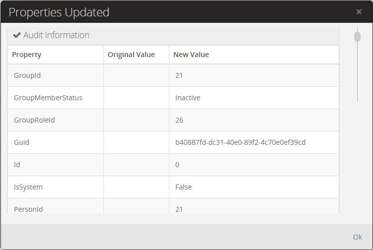
You can set the text of the save button using the SaveButtonText property. Alternatively, if you don't provide a save click handler, the modal will render with only a single Ok button that will hide the modal when clicked.
    <Rock:ModalDialog ID="mdProperties" runat="server" Title="Properties Updated" >
        <Content>
            <!-- your content goes here -->
        </Content>
    </Rock:ModalDialog>
Q - is it possible to prevent the Save button from being enabled if their are client side validation errors?
As seen in several blocks including the CampusDetail block, the NotificationBox displays a standard notice box that the user will not miss noticing. Valid values for the NotificationBoxType property are the standard Bootstrap 3 alert suffixes of "Success", "Info", "Warning" and "Danger". Specify text for the Heading property which will display as a sort of 'title' for the notification box.
    <Rock:NotificationBox ID="nbEdit" runat="server" NotificationBoxType="Danger"
        Heading="Sorry..." />
    <Rock:NotificationBox ID="nbEditMode" runat="server" NotificationBoxType="Info" />

Set the Text property and Rock will do the rest. This also comes in handy when combined with some standard messages found in the EditModeMessage enum:
    if ( ! IsUserAuthorized( "Edit" ) )
    {
        nbEdit.Text = EditModeMessage.ReadOnlyEditActionNotAllowed( Campus.FriendlyTypeName );
    }

    if ( campus.IsSystem )
    {
        nbEditMode.Text = EditModeMessage.ReadOnlySystem( Campus.FriendlyTypeName );
    }
Remember: Use that same friendly, cool (but not cheeky) 'voice' in your the text for your alerts, notifications and dialog windows.
This will create a entry field that that accepts a number that must be less than the specified MaxLength property and fall within the MinimumValue and MaximumValue as shown here:
  <Rock:NumberBox runat="server" ID="tbCode" CssClass="input-mini"
    NumberType="Integer"
    Label="Pin" MaxLength="3" MinimumValue="0" MaximumValue="100" />

To force only whole numbers to be entered, you must specify NumberType with a value of Integer.
And because it inherits from the Rock:RockTextBox you can also use the PrependText and AppendText properties to include some text at the start and end of the field.
TODO Put example here
The PagePicker provides a mechanism to select an existing page. For example, the SiteDetail block uses this to let you choose the default home page for the site being edited. You can also use the Required property to require the user to set a value. If you set the Enabled property to false, the picker will become read-only.
    <Rock:PagePicker ID="ppDefaultPage" runat="server" Label="Default Page"
      Required="true"/>
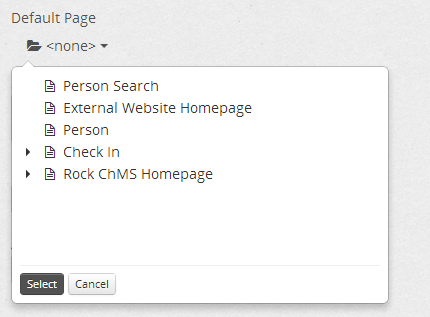
Set the Enabled property to false to make it read-only.
Use the SelectedValue property to get the string (int) or SelectedValueAsInt()to get the int value. To **set** the page picker's selected page use theSetValue( Page )` method.
    // Get the selected page.
    site.DefaultPageId = ppDefaultPage.SelectedValueAsInt();

    // Set the pagepicker's selected page
ppDefaultPage.SetValue( site.DefaultPage );This is used when you need a quick, consistent way to allow the user to select a person from Rock. You can use the Required property to require the user to set a value. Setting the Enabled property to false it will make the picker read-only.
    <Rock:PersonPicker runat="server" ID="ppGroupMember" Label="Person"
      Required="true"/>

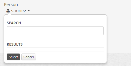
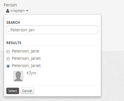
To set the person picker's selected person you must set the PersonId and PersonName properties or use the SetValue( Person ) method if you have a person instance.
    ppGroupMember.PersonId = groupMember.PersonId.ToString();
    ppGroupMember.PersonName = groupMember.Person != null ?
        groupMember.Person.FullName : None.TextHtml;

    // or use SetValue if you already have a "person" object...
    ppGroupMember.SetValue( person );
To get the selected person's id from the picker use the PersonId property, however please note that it's an int-string.
groupMember.PersonId = int.Parse( ppGroupMember.PersonId );Similar to the Rock:PersonPicker, this is used when you need a slightly simpler approach to picking an existing person. It doesn't use a modal window and it's really just intended for those cases where you're just searching for and selecting a person. You really won't be setting an initial value, just getting the one the user selects.
<Rock:PersonPickerSimple ID="ppExistingPerson" runat="server" />
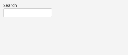
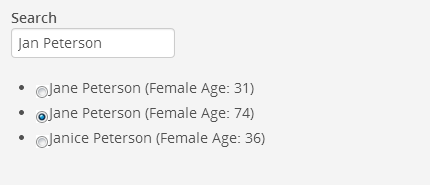
To get the selected person's id from the picker use the PersonId property, however please note that it's a nullable int.
    int? personId = ppExistingPerson.PersonId;
    if (personId.HasValue)
    {
// now go do something with that personIdGenerates a standard Rock checkbox with optional "help" feature (Help property) that slides open when the user clicks the help icon.
    <Rock:RockCheckBox ID="RockCheckBox1" runat="server" Text="Show Child Pages"
  Help="Should child pages be displayed in a menu?"/>

    <Rock:RockCheckBox ID="RockCheckBox2" runat="server" Checked="true"
    Label="Show in Navigation"
    Help="Check the box to show in navigation controls such as TreeViews and Menus." />

Use the Checked property to get or set a value indicating whether the RockCheckBox is checked.
This is a fairly straightforward CheckBoxList control -- except it adds the standard Rock Help and Label properties.
    <Rock:RockCheckBoxList ID="cblGroupTypes" runat="server"
        Label="Group Type(s)" DataTextField="Name" DataValueField="Id"
        Help="Lorem ipsum dolor sit amet, consectetuer adipiscing elit." />

You can data-bind the RockCheckBoxList as you would any typical control. Be sure to specify which properties you want to use for the DataTextField and DataValueField in either the markup declaration or in the code behind.
    cblGroupTypes.DataSource = kiosk.GetLocationGroupTypes();
    cblGroupTypes.DataBind();
Since the Items property is simply a standard ListItemCollection of ListItems you can operate as you would with a normal CheckBoxList as shown in this example:
    var groupTypeIds = new List<int>();
    foreach(ListItem item in cblGroupTypes.Items)
    {
        if ( item.Selected )
        {
            groupTypeIds.Add( Int32.Parse( item.Value ) );
        }
}The smart guys that created Rock made some things even easier for you. Because they added a bunch of extension methods for the standard ListControl, you can now data-bind the *List type controls using these additional techniques...
Bind your list to an enum like this:
    // example using the Gender enum
aListControl.BindToEnum( typeof( Rock.Model.Gender ) );Bind your list to a DefinedType that's in the Rock.Web.Cache.DefinedTypeCache:
    // Grab the GUID for the Person Record Status DefinedType...
    var guid = new Guid( Rock.SystemGuid.DefinedType.PERSON_RECORD_STATUS);

    // Now grab it from the cache and bind a list to it...
aListControl.BindToDefinedType( DefinedTypeCache.Read( guid ) );This is used to create a standard Rock drop down list. Similar to the DataDropDownList and the RockCheckBoxList this is a fairly straightforward type of DropDownList control -- except it adds the standard Rock Help and Label properties and gives you the additional databinding capabilities described earlier.
    <Rock:RockDropDownList ID="ddlGenders" runat="server"
      Label="Genders" Help="Test for the help text" />
    // Bind the drop down to the Gender options:
    aListControl.BindToEnum( typeof( Rock.Model.Gender ) );
If you set the EnhanceForLongLists property to true, the DropDownList will enable the Chosen plugin (by Harvest) search feature which makes finding things in the long drop down a breeze.
<Rock:RockDropDownList ID="ddlRoles" runat="server" Label="Role"
  AutoPostBack="true" OnSelectedIndexChanged="ddlRoles_SelectedIndexChanged"
EnhanceForLongLists="true" />Are you seeing a pattern yet? This control will create a set of radio buttons. In addition to the databinding examples showed earlier with the other similar controls, here's another declarative approach which might make sense in certain situations.
    <Rock:RockRadioButtonList ID="rblUrgent" runat="server" Label="Urgent Status">
        <asp:ListItem Text="all" Value="all" Selected="True"></asp:ListItem>
        <asp:ListItem Text="only urgent" Value="urgent"></asp:ListItem>
        <asp:ListItem Text="only non-urgent" Value="non-urgent"></asp:ListItem>
    </Rock:RockRadioButtonList>

Have you got some text or html you want to 'label'? If so, this is the for you.
    <Rock:RockLiteral ID="litSelectedItem1" runat="server" Label="Selected Item"
        Text="<i class='icon-ok'></i> " />
    <Rock:RockLiteral ID="litStatus" runat="server" Label="Status" />

Use this control for all your standard textboxes.
    <Rock:RockTextBox ID="tbName" runat="server" Label="File Name"
      Placeholder="C:\tmp\file.txt"  />
    <Rock:RockTextBox ID="tbQuery" runat="server" Label="Query"
      TextMode="MultiLine" Rows="5" CssClass="input-xlarge" Help="Go ahead,
      don't be shy.  Put all the helpful information you can think of in
      here.  That's what it's here for.  If there is some question that the user
      may not know what to type in here than this is your online documentation tool." />
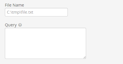
Use the PrependText and AppendText properties to put standard formatted text around your textbox:
     <Rock:RockTextBox ID="tbAppPrepend" runat="server" Label="Amount"
        PrependText="$" AppendText="<i class='icon-ok-sign'></i>" Placeholder="0.00"  />

This renders out a small image button that can be used to set security for your item.
    <Rock:SecurityButton ID="btnSecurity" runat="server"
        class="btn btn-mini pull-right" />

Setting the Title property let's you control the header title on the modal popup:
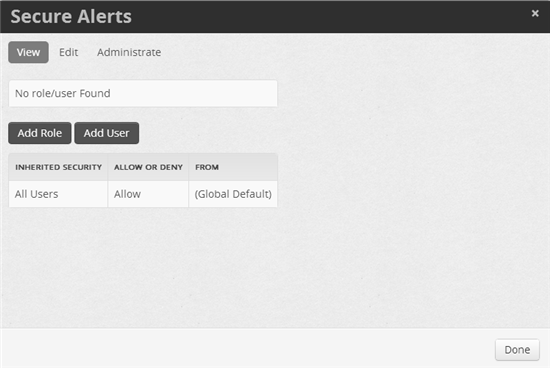
Use the Visible property to control whether or not to show the button:
btnSecurity.Visible = report.IsAuthorized( "Administrate", CurrentPerson );In your block's OnInit() method you need to set the EntityType property of the security button. Later in your code, when you know what item is being edited, you can specify the actual Entity ID via the EntityTypeId property.
    protected override void OnInit( EventArgs e )
    {
        // ...
        btnSecurity.EntityType = typeof( Rock.Model.Report );
    }

    // elsewhere in your code you can set the actual entity Id
btnSecurity.EntityTypeId = report.Id;This is similar to the Grid's ToggleField, but it can be used standalone in your block.
    <Rock:Toggle ID="tShowPreview" runat="server" Label="Show Preview?"
        OnText="Yes" OffText="No" Checked="true"
        Help="If set to yes, a preview will be shown immediately as you
          update your criteria." />

Use the Checked property to see if the toggle is currently 'on' or 'off'.
You can also set a handler for the OnCheckedChanged property if you want auto-postback handling.
    protected void tShowPreview_CheckedChanged( object sender, EventArgs e )
    {
        var text = "You just set it to " + ( ( tShowPreview.Checked ) ? "on" : "off");
}HOME > Dev 202 > UI Toolkit
- Rock:AccountPicker
- Rock:AttributeEditor
- Rock:Badge
- Rock:BootstrapButton
- Rock:ButtonDropDownList
- Rock:CampusPicker
- Rock:Captcha
- Rock:CategoryPicker
- Rock:ConfirmPageUnload
- Rock:DataDropDownList
- Rock:DataTextBox
- Rock:DateTimePicker
- Rock:FileUploader
- Rock:Grid
- Grid Rock:BadgeField
- Grid Rock:BoolField
- Grid Rock:DateField
- Grid Rock:DateTimeField
- Grid Rock:DeleteField
- Grid Rock:EditField
- Grid Rock:EditValueField
- Grid Rock:EnumField
- Grid Rock:ReorderField
- Grid Rock:SecurityField
- Grid Rock:ToggleField
- Rock:GroupPicker
- Rock:HighlightLabel
- Rock:ImageUploader
- Rock:ModalAlert
- Rock:ModalDialog
- Rock:NotificationBox
- Rock:NumberBox
- Rock:PagePicker
- Rock:PersonPicker
- Rock:PersonPickerSimple
- Rock:RockCheckBox
- Rock:RockCheckBoxList
- Rock:RockDropDownList
- Rock:RockLiteral
- Rock:RockRadioButtonList
- Rock:RockTextBox
- Rock:SecurityButton
- Rock:Toggle
TOC Test
[[TOC]]