This repository has been archived by the owner on Apr 25, 2024. It is now read-only.
Releases: benlau/quickandroid
Releases · benlau/quickandroid
v0.1.4 release
New Components
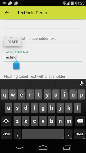
TextField
Features
- Material Design look and feel
- Long press will show PASTE button
- Text handle to move cursor and selection
- Floating Label
RaisedButton
System
- Rename package of QuickAndroid.priv to QuickAndroid.Private
- QASystemDispatcher::dispatched() - Changed the name of first argument from “name” to “type. Following the naming convention of Flux application framework
ActionBar
- Changed the default height from 48p to 56dp
TabView
- Emit appear() and disappear() signal for index changes.
FloatingActionButton
- Use Theme.colorAccent as default color
TextStyle
- Added “disabledTextColor” property
- Added “bold” property
v0.1.3 release
Critical Changes
- Min requirement of Qt version has been raised to Qt 5.4
- Dropped QuickAndroid.def package. All the constant value has been merged into Constants singleton component.
- Renamed the package of QuickAndroid.style to QuickAndroid.Styles
- Dropped Style singleton component. User should get current theme from ThemeManager.currentTheme from QuickAndroid.Styles package.
- All the Style components use DP unit for component size.
The following components are dropped. They are not implemented by Material design :
- PopupMenu
- DropDownList
- Spinner
New Components
- TabBar and TabView
- DropDownMenu
- Paper
- Text
- Button
Style Components
Added “extend” property for user to create derived style class form existing Theme object.
Example:
ActionBar {
    style: ActionBarStyle {
    extend: [ ThemeManager.currentTheme.actionBar, {
       “titleTextStyle.textColor” : Constants.white100
    }  ]
   }
}
or
ActionBar {
   style: ActionBarStyle {
      Component.onComponent {
         merge(this,ThemeManager.currentTheme.actionBar);
            titleTextStyle.textColor = Constants.white100
         }
   }
}
Drawable Provider
- Bug Fix - Crash on handling mono image (1bit depth)
- Bug Fix - It don’t resize image according to sourceSize.
Drawable
- Now it may take Component as input to source property
e.g
Drawable {
    source: Rectangle { color:”red” };
}
- Bug Fix - Can not handle Color object as input to source property
Action Bar
- ActionBarStyle - Added “unitHeight” property to control the heigh of control item.
- Reimplemented by Material Design
- Title is not part of action button
- Move title according to keyline
- Added iconSource, background properties
A
- Changed the implementation from C++ to QML
- Added A.px() and A.drawable() functions
FloatingActionButton
- Added “size” property to choose large/small size of button
Activity
- “actionBar” property is not a component anymore. Now it take Item type.
ListItem
- ListItemStyle - Added “showDivider” property
v0.1.2 release
New Components & Features
- Support tintColor in QADrawableProvider.
- ListItem
- FloatingActionButton
System
- QADrawableProvider
- Supported to load image from drawable/ folder. Not only from drawable-*dpi
- May tint a drawable image by using tintColor argument to provider.
Android Integration
- Added QuickAndroidActivity.java as an alternative Activity class for launching Qt application
- Once the onActivityResult() is invoked, it will forward the arguments to SystemDispatcher
- SystemDispatcher
- Add onActivityResult() helper function to forward the arguments passed to onActivityResult.
ActionBar:
- Align icon and title according to keyline as described in Material design
- Renamed the "icon" property to "iconSource"
Deprecated:
- DividerHorzonalHoloLight - Replaced by ListDivider
First Release
Features
- Provide “DP” unit
- Page transition management
- "Back" to previous page by the hardware back button
- Unified “Drawable” component
- A single component that supports color , image , QML component, simulated nine patch image as input source
- Auto scale image to fit current screen resolution
- Derived StateListDrawable for animated drawable like button
- Image provider that will find the right image for current resolution automatically.
- Theme / Style Engine
- A set of components with native look and feel on Android
- SystemDispatcher - C++ and Java communication manager.
- Auto conversion between C++ and Java data type. No need to write in JNI.
