-
Notifications
You must be signed in to change notification settings - Fork 1
Visual Setup
This section explains which data fields are needed for the visual to work and which settings can be adapted in the format pane to customize the visual.
The visual has 9 data fields for different capabilities. For basic functionalities only the first two are needed
The data field added here is used as a shared X-Axis for all plots. The datatype must be numeric or date. Null values are not supported.
Data fields that contain y-Values. For each data field a separate plot is created. The data type must be numeric. Null values will be ignored. Maximum data fields: 20.
Length data for creating overlay rectangles or lines for individual plots. Values must be numeric and specify the length of the rectangle in data points of the X-Axis. For example when the value 11 is specified at data position 8, an overlay rectangle is created from the position of the 8-th x-value until the position of the 19-th x-value. Null values are ignored
Specifies the size of an overlay rectangle in y-direction. At each position where a numeric value was provided for Plot Overlay: Length the size in y-direction must be provided. All other values should be null.
Specifies an optional y-position for the bottom line of each rectangle. When no data is provided the rectangles start at 0.
Contains data that is displayed in a custom tooltip when hovering over a data point. The order of the tooltips matches the order of the data fields. Supported data types: numeric, date, text.
Text data that is used for creating a color mapping for data points. Each unique text value is mapped to a color and added to the categorical legend in the bottom of the visual. For plots that use this legend the data points are colored based on the corresponding text value specified here. Null values and empty strings are ignored.
This column supports numeric or text data that is used to filter all plots using the categorical legend. For each unique value in the column a legend is appended to the bottom of the visual that can be clicked on to hide all points with the corresponding value. If the data is numeric and contains only 0 and 1 the data is treated as boolean and data points with 1 can be hidden by clicking on the legend. Null values and empty strings are ignored.
This data column is used to draw a background over all plots in different colors. The unique values are mapped to a color and added to the legend at the bottom of the visual. The background is then drawn from the corresponding data point on the X-Axis to the next point.
This column can be used to add Categories for grouping the rest of the data. The provided data is not used for any other purpose by the visual.
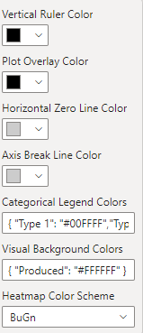
All colors that affect the whole visual can be adjusted here.

Sets the color of the line that is displayed on each plot for better orientation when hovering over a data point.
Color of the rectangles or lines that are drawn over the plots and explained in Plot Overlay: Length.
Sets the color of the line that is drawn when the lowest value on the Y-scale is smaller than 0 for one plot.
Sets the color of the dashed line that is drawn between two data points when they are further apart then specified in X-Axis Break Settings and X-axis break is enabled.
Sets the colors for the categorical legend in JSON format.
Example:
{ "Category 1": "#00FFFF","Category 2": "magenta"}All categories not specified here get the color from a default color mapping.
Specifies the colors for the visual background categories. The data format and mapping is the same as in Categorical Legend Colors.
Sets the color scheme for all displayed heatmaps in the visual.
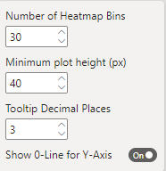
Settings that affect the whole visual

Sets the resolution of the heatmap. When set to 10 for example the domain of the X-axis is divided into 10 equal pieces that are used for binning.
Sets the minimum height per plot in pixels. A scrollbar is added when this height cannot be fulfilled with the current visual height.
Sets the decimal precision for numeric tooltip values.
Displays a horizontal line at position 0 when set to true. Color can be adjusted in color settings.
For each data column in Categorical Legend and Categorical Filter the name that is displayed in the legend at the bottom of the visual can be changed.

Plot settings can be set individually for each plot.

Sets the title that is displayed in the top left corner of each plot. The default value is the column name.
Choose if a plot is drawn as line plot or scatter plot.
Sets the color of data points and connecting lines.
When set to true the data points are colored depending on the Category specified in Categorical Legend. For all points where Categorical Legend is null or an empty string the color specified in Plot Color is used.
Displays a heatmap under the plot that shows the difference between the highest and lowest value of one bin. A heatmap legend is added on the right side of the plot.
For each plot it can be chosen if an overlay with rectangles or lines should be drawn with the data from Plot Overlay: Length and Plot Overlay: Width
Sets a numeric factor each plot to adjust the plot height. When set to 2 for example the plot has twice the height of a plot with height factor 1.
One of the following settings can be chosen to display at the X-Axis:
- None (no ticks and no labels)
- Labels only
- Ticks only
- Ticks and labels
Specifies the label name that is displayed when X-Axis is set to labels only or ticks and labels.
Same settings as in X-Axis and X-Label for the Y-axis.
If enabled the bottom value of the Y-axis will be Minimum Y-Value. When the toggle switch is off, the bottom value of the Y-axis will dynamically adapt to the lowest value visible.
Sets the minimum Y-axis value of the plot.
Similar to Fixed Y-Minimum and Minimum Y-Value but for the top value of the Y-axis.
Toggles if the Y-Scale ticks should be formated with an SI-Prefix. If the setting is enabled 1500 would be displayed as 1.5k for example.
Sets the Precision for the Y-Scale ticks. If Y-Scale SI-Prefix is enabled the number accounts for the total number of digits. If it is disabled, the number accounts for the decimal places.
For each data column in the Tooltips field a title can be defined that is displayed in the tooltip information next to the corresponding value when hovering over a data point.


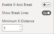
Switches from numeric or date X-scale to a linear X-scale where all data points are equally distributed on the X-axis. This can be useful if there are large step sizes between some data points.
Toggles if a vertical dashed break line should be drawn between all data points that are further apart than Minimum X-Distance on the X-axis. This line makes it easier to see which points are far apart.
Specifies the minimum distance of two neighboring data points on the X-axis for drawing a break line between them. If X-axis is of type date the distance is interpreted as seconds.

Toggles if zooming and panning on the X-axis is enabled.
Sets the maximum possible zoom factor.
Saves the zoom state of the visual when enabled so that it does not reset to the origin after making changes in the formatting pane or when selecting different data.