-
Notifications
You must be signed in to change notification settings - Fork 1
Graphic example
Manuel Reif edited this page Mar 7, 2014
·
9 revisions
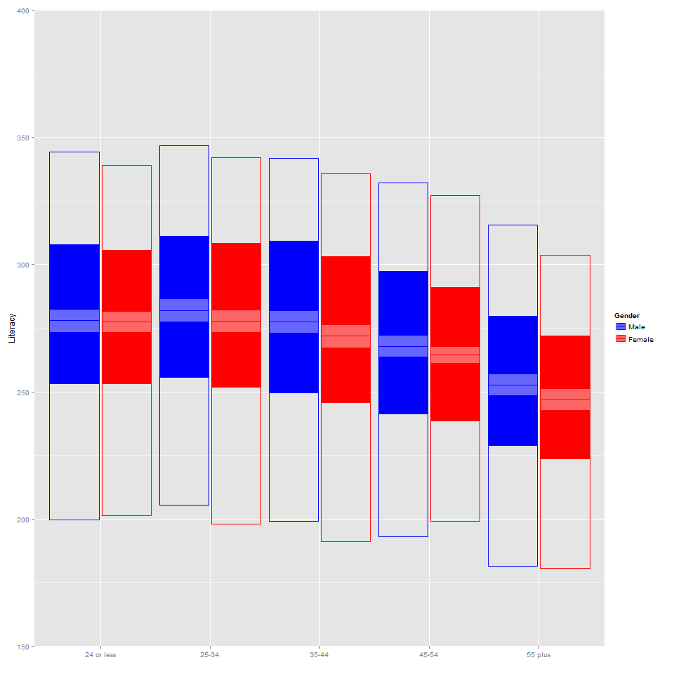
To create some graphics, which look similar to these (click) we use ggplot2 again. Make sure you sourced the code from the first tutorial (packages, data and all objects are loaded/created). We are starting from this point by computing means and quantiles for the austrian data set for the supplied variables. We try to create a graphic which includes means, confidence-intervals and 0.05, 0.25, 0.75. 0.95 quantiles to somehow show significant differences and distributional information in one graphic.
g_litpm    <- svyPVpm(by= ~ GENDER_R + AGEG10LFS, svydat=sd2, pvs = LITERACY)
g_litquant <- svyPVquantile(by=~ GENDER_R + AGEG10LFS, svydat=sd2, pvs=LITERACY, quantile=c(0.05,0.25,0.75,0.95))

gall <- merge(g_litpm,g_litquant)

necn <- gsub(":","_",grep(":",colnames(gall),value=TRUE))
colnames(gall)[grep(":",colnames(gall))] <- necn

SIZE <- 0.3
WID  <- 0.95

g1 <- ggplot(data=gall, aes(x=Group2, y=PVLIT_mean, ymin=q0.25,  ymax=q0.75,color=Group1))
g2 <- g1 +  geom_crossbar(aes(fill=Group1),position = position_dodge(width = WID), size=0, alpha=1)
g2b <- g2 + geom_crossbar(aes(ymin=q0.05,  ymax=q0.95),position = position_dodge(width = WID),  size=SIZE)
g3 <- g2b + geom_crossbar(aes(ymin=PVLIT_mean - 1.96*PVLIT_mean_SE,  ymax=PVLIT_mean + 1.96*PVLIT_mean_SE),
position = position_dodge(width = WID), size=SIZE, fill="white",  alpha=0.4)
g4 <- g3 + scale_fill_manual(name="Gender",values=c("blue","red")) + scale_color_manual(name="Gender",values=c("blue","red")) +
coord_cartesian(ylim=c(150,400)) + xlab("") +
ylab("Literacy")

print(g4)
